Nicolas Schwabach and Magno Silva relay their experience of using machine learning methodologies to improve lead generation. In doing so, the 'marketing mathematician' and algorithm developer seek to demystify machine learning approaches in marketing.
Website, email, telesales, social media, direct mail, SEO, paid ads, ambient media, surveys…
There are so many lead generation options that sticking to your current strategy might not be the best option. The follow-on question is whether it is worth trying to follow a new strategy by yourself, or hiring a machine learning expert or a marketing mathematician to take the guesswork out of making a decision.
In this article we’re going to discuss how data can be used beyond the cookie cutter strategies and suggestions most marketers use. And we’ll demystify the perplexing, baffling logic behind machine learning technology.
So how does machine learning work?
 Machine learning involves teaching computers to look for patterns, learn from them and present resulting insights to human beings. For instance, you can provide the ‘machine’ with information about how many people are coming to your website, opening your emails, reading about product A or product B, etc and find a pattern as to whether they actually bought something or not. In this simplistic example, the algorithm is deriving patterns from a sales funnel which it would take marketers much longer to correlate.
Of course, machine learning is capable of far more advanced data insight than this.
The problem with identifying correlations is that people are prone to see statistical mirages and their capacity to find patterns are limited. Even if you think you found a pattern it’s only a very basic one.
The reason these machines need to “learn” is because they are looking at such complex problems that they can’t figure stuff out in one go. The algorithm starts with a random guess and slowly improves its guess until it actually figures the optimal result.
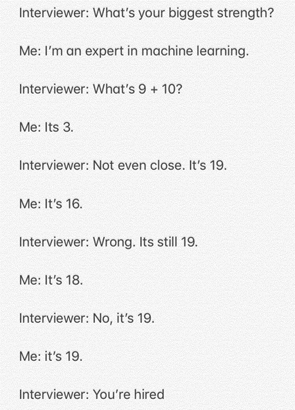
That meme is an excellent way to understand the logic behind it. In the case of neural networks you just replace the question “What’s 9 + 10” with:
min E[(Y−GN(β,X))2]
s.t.
Gn = An(n. Gn-1 + biasn)
G1 = A1(1. X + bias1)
Where X is input data, Y is the target variable, An is the activation function for the n-th layer and are the parameters.
Alternatively…
You have a lot of data that a bunch of number-crunchers have extracted hundreds of KPIs from but you can’t even go through all the KPIs let alone the original data. Most marketers think:
“I would like to market products to X, I’ll offer this and I’ll contact them every week”
“I’ll guesstimate how to divide my budget”
“I’ll manually decide what the consumer journey should look like”
“I’ll create some random offers to entice my customer and see what happens”
Or you can just get some very complex algorithms to take all your data, look at a bunch of patterns at the same time and help you make better decisions about that.
Let’s pick our own marketing service business as an example.
Impact on sales
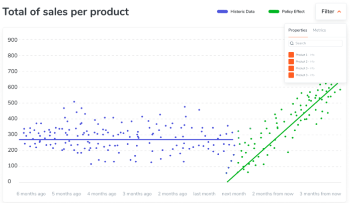
The blue dots below were daily sales based on using our old lead generation technique. Some days we had 300-ish sales, other days we had 400, etc. (this is real data by the way). The green dots refer to a change in strategy after we started implementing our AI-backed lead generation strategy.
There were two elements that underpinned the success of the AI-backed strategy:
- It analysed at speed what was working and not working from previous marketing efforts
- It identified patterns from user behaviours, forming a greater understanding of what each customer wanted, when and for how much – helping to generate more enticing offers.
The breakthrough moment came when we discovered that it was scalable. It currently stands to win 650 clients per month 3 months from now. We can say that the new strategy definitely had an impact!
Impact on ad clicks
We used machine learning technology to forecast future ad click performance. This is a good test to see if statistical assumptions are correct, while also informing business decision-making.
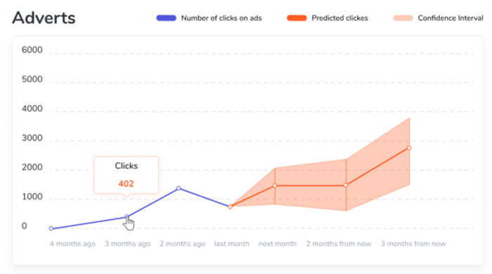
The next graph shows the number of ad clicks: in blue we have the total number of clicks per month in the last 4 months and in orange we get our forecast about how many clicks we’ll be getting and what’s called a ‘confidence interval’. Since we can’t predict the future exactly we can try to predict a range of values for what we’ll get.
We can see that for next month we’re expecting to get 1400 clicks but any number between 800 and 2000 is still within the margin of error. It’s the same idea behind voter polls, you can get a central expectation but you know reality can be a few points up or down from what was expected.
Impact of marketing variables
Moving on to the Causality graph we can see the importance of each variable on sales. This is specially useful to determine which of the marketing variables are the most relevant. In this particular example we’re only looking at 3 variables:
- Number of visits
- Time period
- Number of likes
How do these variables impact on sales? The left-hand column lists each variable, while the dots are coloured according to whether they are high or low in value (red being high, the brightest blue being low, and shades in between representing values in between). For example, a red dot on the ‘Visits’ line represents a high number of website visits.
Dots to the right of the vertical line represent a positive impact on sales, while dots to the left coincide with a fall in sales. For instance, when the number of visits are high then sales are higher.

Red dots to the left mean that higher values of the variable decrease total sales, for instance as time passes sometimes sales decrease although most of its red dots are to the right so in general as time passes sales increase.
Blue dots to the right means that low values for the variable decrease total sales, we can see in our graph that sometimes even with lower number of Visits we still had more sales than average. We can see the very blue dot for Visits to the left really pulling sales down. The same goes for the Period blue dots meaning that dates further into the past had lower sales.
Finally we can see the Likes dots coming pretty close to zero meaning that getting likes in itself didn’t help performance any better or worse, or maybe it’s importance is too small to be perceived.
Clustering results
Finally we have the Clustering results, here we see the results of clustering customers by similar behaviours and look at what the average profile for each cluster of customers looks like.
- The Price columns show how much each profile usually pays
- QTY shows the average quantity of products bought per purchase
- Customer Lifetime shows the number of days between the first and last purchase
- Count is the number of purchases during their whole lifetime
- Avg Days Per Order is the frequency of purchases
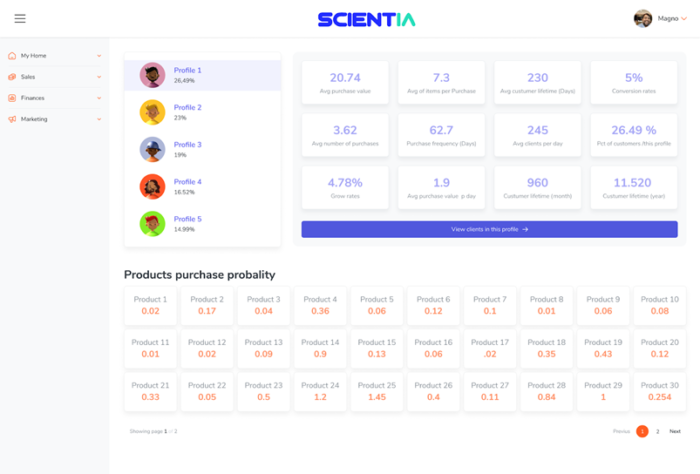
“Algorithm of Things” and “Algorithm” are just made-up names for the product the company sold to protect our client’s identity. The value under it shows the probability of buying that particular product. There was a lot more information about each profile to show so we made another screen with the full clustering info.

In this final screen we have a lot more details about each profile and the chances of them buying each product the company offers. There is also a neat button that lets you know which customers are in each profile. Now marketers can make much better decisions determining when to contact each customer, what to offer, make special offers and more.
Want to feed your grey matter with more great insight from around the globe? Sign up to our newsletter.
Data-driven commissions
Let’s apply this statistical modelling to predict ROI and lead generation improvement techniques by commissioning a professional copywriter.
In the bar chart below we see the actual in-house cost of generating say, 100 qualified leads using various lead generation techniques for a B2B business shown by the lines in red.
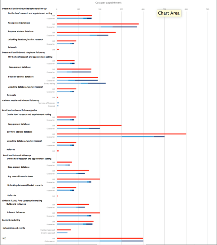
We can statistically predict the typical marginal increase in response using a professional copywriter shown by the lines in blue, with medium blue for average copywriter improvement response, dark blue for a less-than-expected response and light blue illustrating the highest hoped-for response – and consequently the lowest cost per qualified appointment improvement.
The copywriter’s marginal increase in the business’s initial email, direct mail and content marketing response will also have a marginal increase on the B2B business’s telesales follow-up performance.
This in turn means the business will need fewer emails / fewer mailers / less content and need fewer follow-up calls all of which can be accurately costed using “inverse logic” to work out the population required to meet a given target number of qualified leads and the costs thereof.
Although the copywriter’s fee will always be higher than the business’s in-house efforts, the final cost of generating say, 100 qualified leads will be generally lower.
As its name suggests, The No-More-Guessing Tool takes the hitherto uncertainty out of lead generation calculations and projections.
Nicolas Schwabach is a copywriter,
marketing mathematician and
CEO of Curious DM
www.curious.dm
Magno Silva is founder and CEO of Scientia
“Math Magic for Business“
Rio de Janeiro, Brazil
https://scientia.site


Leave your thoughts