For long-term business profitability, e-retailers aim to encourage repeat custom by providing visitors to their websites with a simple and efficient user experience (UX). But not all online strategies are completely ethical, says Hilary Stephenson – some deploy psychological persuasion techniques, such as scarcity ‘offers’ or unclear signposting. She cites e-commerce research that reveals some larger organisations – such as fashion brands – have used ‘dark UX’ website design patterns to prompt ‘fear of missing out’ impulse buys. It’s not a good look for the e-retailer, she says, and explains why.
The e-commerce boom sees no sign of slowing, with recent figures showing that online UK sales have seen double-digit growth in the past five years alone.
This stratospheric rise has been driven by a number of factors; not least the speed and convenience that online shopping offers busy consumers in today’s on-demand society. What’s more, the ease at which entrepreneurs can now set up online retail businesses, unconstrained by the obstacles of traditional bricks-and-mortar operations, means that the number of e-commerce sites has soared in the past few years.
With so many brands moving into the pure play online space, following on the success of industry giants such as Amazon and Boohoo, the market is becoming increasingly dog-eat-dog. Retailers face a constant battle to keep pace with their peers – many of whom may be offering extremely similar products at a comparable price point – and this is where website user experience (UX) design is a game changer.
Great UX design allows consumers to navigate with ease through a website, providing a shopping experience that is both pleasing for the end user and profitable for the retailer, too. If retailers can make the shopper’s online journey as simple, seamless and enjoyable as possible, it removes a number of key barriers to purchase – for example, unnecessary account sign-ups or a confusing user journey. This means that consumers are more likely to spend. In this regard, UX can be extremely lucrative.
However, as the e-retail landscape becomes ever more competitive, we have begun to see major retailers subverting best practice and using some of the principles of UX design in a duplicitous way to trick customers into spending more money on their sites. These ‘dark UX’ methods, in which website interfaces are deliberately designed to tap into a range of established behavioural psychology traits – such as the ‘fear of missing out’ – are becoming extremely commonplace in modern e-retailing.
Dark UX patterns are premeditated; well thought-out and based on behavioural psychology.
We completed an evaluation of the strategies that some brands use on their websites to boost sales in December 2016, and revisited the subject again recently. Worryingly, we saw no major improvements in the cross-section of retailers we investigated.
 So, what are the key ways in which major retailers employ dark UX patterns to get consumers to spend more?
Dark UX: the methods
Upselling and auto-renewal
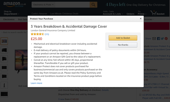
 Amazon draws users to its Prime service with strong contrast around the ‘sign up’ button and poor contrast around the important details, for instance after the free trial, the user will be billed monthly for the service. Having clicked to buy an electrical item, instead of clicking straight through to either the basket or the checkout pages, the site displays a pop-up for breakdown cover, drawing the shopper’s attention towards a yellow ‘Add to basket’ button and away from a greyed-out ‘No thanks’ button. Given that we are drawn towards visual elements which stand out from their surroundings, it’s clear that Amazon is trying to encourage the user into adding a – potentially unnecessary – extra purchase.
Buy it now or regret it later
Shoppers hate to feel they’ve missed out. Both fashion retailers Boohoo and Pretty Little Thing capitalise on this by urging customers to complete their purchases before a ‘limited’ delivery offer is no longer available. However, it is unclear whether the offer is genuinely limited, or simply a countdown to a regular, daily occurrence. Shoppers may once again be panicked into buying an item at that moment, instead of taking time to reflect on whether it is what they really want or need.
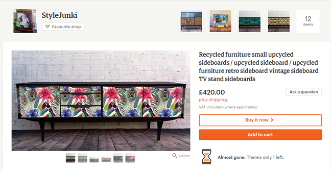 Similarly, marketplace Etsy was also found to be using scarcity tactics to encourage shoppers to purchase through the illusion of limited stock and competition for a particular product. Underneath the ‘Add to Cart’ button, the store provides live ‘updates’ on the number of products still available. This is particularly provocative for a retailer of ‘handmade’ products, which are likely to be made in small quantities. However, the claim is unsubstantiated and may be used deliberately to accelerate purchase.
False incentivisation
Research also showed that major electrical retailer AO.com offers discounts on sale items for shoppers to apply during the checkout process – but that these were later difficult to both find and redeem. While incentivising purchase is not misconduct in itself, AO.com appears to have offered an extra promotion at this crucial stage in the process to tempt shoppers into buying items already on sale, but has not clearly signposted such codes in the checkout process.
Checkout manipulation
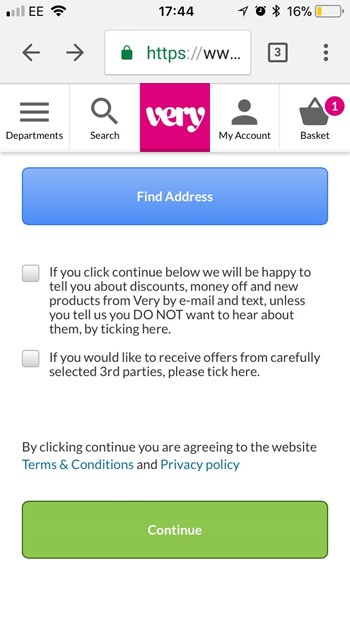 Women’s fashion e-retailer Very deploys complex UX during the checkout process to encourage users to sign up for both its own and third-party marketing materials. Two ‘opt in’ and ‘opt out’ checkboxes – both using vague and convoluted language – were clearly intended to support Very’s marketing objectives without making it clear to the customer what they were signing up for.
River Island was also found to be prioritising data collection over user experience, not allowing shoppers to checkout without going through a lengthy process of creating an account, where data such as their email address is collected.
Transparency is key
While we understand that the retail landscape is extremely competitive at the moment – particularly in an age where e-commerce sites can quite literally ‘pop up’ out of nowhere – it’s concerning that big-name brands are using some less than transparent strategies to try and squeeze more money or data out of consumers.
We had hoped to see an improvement on the use of dark UX patterns since completing a similar study just over a year ago. However, it seems that these arguably unethical practices are still very much in place. The examples listed here are just a brief cross-section of what we know is happening across the commercial sector – not just in retail, but in the leisure, travel and other business sectors, too.
User experience strategies are supposed to provide a simple, positive and encouraging means for consumers to interact online with a product or service, but in a climate where consumers are more discerning than ever, brands have a business imperative as well as a moral obligation to behave ethically and transparently. UK retailers would do well to remind themselves of this in future.
Have an opinion on this article? Please join in the discussion: the GMA is a community of data driven marketers and YOUR opinion counts.
This topic and much more will be under discussion at our MINT Data Driven Marketing Summit on Wednesday April 18 in central London. GMA readers can get £100 off the ticket price. Book NOW to hear top-level speakers share their knowledge about GDPR, innovation and the new data economy.


 So, what are the key ways in which major retailers employ dark UX patterns to get consumers to spend more?
 Amazon draws users to its Prime service with strong contrast around the ‘sign up’ button and poor contrast around the important details, for instance after the free trial, the user will be billed monthly for the service. Having clicked to buy an electrical item, instead of clicking straight through to either the basket or the checkout pages, the site displays a pop-up for breakdown cover, drawing the shopper’s attention towards a yellow ‘Add to basket’ button and away from a greyed-out ‘No thanks’ button. Given that we are drawn towards visual elements which stand out from their surroundings, it’s clear that Amazon is trying to encourage the user into adding a – potentially unnecessary – extra purchase.
 Similarly, marketplace Etsy was also found to be using scarcity tactics to encourage shoppers to purchase through the illusion of limited stock and competition for a particular product. Underneath the ‘Add to Cart’ button, the store provides live ‘updates’ on the number of products still available. This is particularly provocative for a retailer of ‘handmade’ products, which are likely to be made in small quantities. However, the claim is unsubstantiated and may be used deliberately to accelerate purchase.
 Women’s fashion e-retailer Very deploys complex UX during the checkout process to encourage users to sign up for both its own and third-party marketing materials. Two ‘opt in’ and ‘opt out’ checkboxes – both using vague and convoluted language – were clearly intended to support Very’s marketing objectives without making it clear to the customer what they were signing up for.


Leave your thoughts