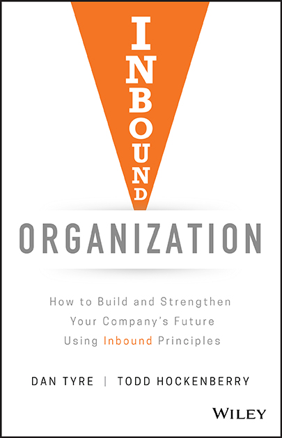
There’s been a major shift in how businesses grow, how buyers purchase and how businesses build meaningful conversations and customer relationships. Companies that align their mission, strategies, action plans and tools with the way buyers think, discover and purchase will have a huge competitive advantage, says Todd Hockenberry. So, take a long look – is your website truly your best-ever and most enticing shop window? Here’s how to make sure it is, and that it deals with changes in buyer behaviour in order to stay ahead of the curve. Check out this expert user experience guide.
The easiest way to tell if a company is customer-centric or internally focused is to look at their website. A customer focused or Inbound Organization starts the buyer’s journey by creating a website that provides lots of helpful information that first attracts, then engages their target persona.
One of the biggest mistakes we see companies make is thinking that a website is an expense and not an asset. Remember, your company website is your very first impression to most contacts, and communicates your brand message, engages your audience and should basically be your best salesperson. Too often, companies cut corners and don’t use the best tools to accomplish their goals or refuse to hire the best talent to manage their web presence. Many companies believe that ‘if you build it they will come’, so they just set it and forget it.
Your user experience guide
A great website can be within any company’s reach if they optimise for user experience. Here are some things you better do if you want to keep visitors on the site for more than three seconds.
1. You can help me, but please don’t give me a sales pitch
Get rid of the fluff, marketing-speak nonsense. Saying “we deliver great customer service and are value-added, sustainable, problem-solvers” does not help me solve any problem I have and is lazy writing and mildly annoying. Build it for me, from my perspective, and make your site easy to use with a minimum of distractions. Understand how to reach me through SEO by creating content that matches the topics I search and, when I arrive, please show me how you can help with my problems. When my search is in the form of a question, please answer it quickly. You have three seconds. Respect my time, my click, my search and show me with your site that you know how to do that.
2. Show me how to improve my situation, not just try to cash a cheque
Once you clearly state what you do to help me, what problem you solve, what questions you answer then have some meat on the bones when I click deeper into the site. Understand my path through your site and make sure I arrive at the page with the solution I need. Do it in 5-7 words and prove to me that you are focused and clear in what you do and do not do.
3. Use current design ideas, best practice content management technology and functionality
Show me you know the world has changed and are committed to helping me online. You should have a blog because I like current, frequent, sharable, easy to consume and easy to find content delivered to me in the format I want to read. Make sure your site loads fast and looks great on mobile devices. I better not need a microscope to read your pages on my phone or have to get a needle to click a tiny link in the drop-down menu.
4. Be a bit better than the other 10 competitors of yours that I will find in 30 seconds
It is just a fact that I can find any number of competitors just as quickly as I found you. Stand out, be interesting, be unique. Have some character, be fun, be open, authentic, original, and be different. What does that look like? I don’t know, I just want it and I know it when I see it. If you think you are like your competitors, and it is hard to differentiate, then guess what? You deserve to be treated like a commodity and I will constantly ask you to give the me the lowest price (if I talk to you at all).
5. Focus on what makes you special and why it is in my best interest to care
Create great content that is not just about your product. The specs, the technical details, and the features are not what I want to see first. Show me you understand my application, my issues, my situation and create content in different forms to help me: videos, case studies, infographics, articles, testimonials, animated shorts, articles, e-books, checklists, calculators, how-to guides, etc. Know me and anticipate the content I want to consume. Use your content to entice me to dig deeper, because that is what I am looking to do.
6. Share lots of cool info for free
Give me lots of great content before you make me an offer. If you ask me to convert by filling out a form too soon, then I will I refuse. Ask me to fill out a form and exchange my information only after providing me with lots of value and establishing trust. Your catalogue is not valuable to me. Your specifications are not that important until the very end of my buying journey, assuming we get there. Help everyone with great content for free and earn the chance to talk with me if indeed I am a good fit and want to consider a purchase.
7. Give me a great customer experience
Make it easy to find stuff, take the next steps and become engaged with your company. Just because I found you to start with does not mean I will stick around if you fail to engage me and bring me closer to your company and how you can help me. Each step, touch point or connection must exceed my expectations. Miss it at any point in the process and I will drop out.
 8. Let me try before I buy
Find a way to let me take a test drive without a commitment. For online digital and SaaS companies this is standard stuff. What about people that make equipment? How can we demo that? Maybe a demo unit in your factory or a virtual demo video? But we sell a consumable? Think Costco and the guy giving away free samples. Send me a small sample. Sell services? Give me a free assessment or analysis. Find a way to give me a zero risk and no cost test.
9. Make it easy to contact you in many ways when I am ready
We are all different. I like to talk on the phone; my wife hates the phone. Don’t assume we all want to engage the same way. Let me send email, fill out a form, call on the phone (your phone number on the site better be click to talk since I am probably using my mobile phone), start a chat, send a text. Make it so natural and easy to connect with you that I do so.
Bonus – be nice, be human, B2H
Don’t bombard me with spam-like follow up emails or ask for just 15 minutes of my time to review how great the product is, or assume I am ready to talk to a salesperson just because I downloaded an eBook. When we do talk, when I am ready, be pleasant, happy, nice – not aggressive, and focused on my needs – not your sales quota.
I am human, different, unique, special. Treat me that way with your website because, after all, your site is all I know about your company until I decide to learn more and engage with you. My experience with your site is your best chance to persuade, convince and move me to act. Get it wrong and there will be no further conversation and you will never see me again!
Have an opinion on this article? Please join in the discussion: the GMA is a community of data driven marketers and YOUR opinion counts.


Leave your thoughts