Consumers are becoming increasingly connected, meaning that browsing on the go has become the norm. When it comes to web optimisation, James Rosewell says the future of browsing is mobile.
The days of the desktop dominating web browsing are gone; mobile is swiftly becoming the most prevalent platform. Amazon.com is a prime example. SimilarWebs’ engagement data suggests that visits to the site from mobile and desktop are now almost equal. This shift brings a new level of complexity to web optimisation.
Is responsive web design a race to mediocracy?
Although many websites recognise the need, few are able to fully optimise for every device and browser now hitting websites: desktops; smartphones; tablets; e-readers; smart TVs.
Historically, responsive web design (RWD) was seen as the solution to addressing the needs of different devices and screen sizes. While RWD enables a website to dynamically change its appearance for different devices, it is limited. Often, it will simply result in the addition or reduction of columns on a page with navigation layout changing. In some cases RWD will actually remove a proportion of content because it takes up too much space.
Proponents of RWD believe that the same navigation and content should be used irrespective of type of device. However, RWD does not consider the consequences of changing a multi-column newspaper site (for example) into a single column site for smartphones: the page becomes very long and user experience suffers. For example, on a standard iPhone, The Wall Street Journal homepage is more than three metres tall. This amount of content squeezed into a smartphone-friendly screen size results in the need for continuous scrolling to read stories, which is a negative user experience for many.
RWD also has an impact on sites that rely on advertising. RWD can cause adverts to be resized into non-existence, laid out on the page in a manner that disrupts users’ browsing experience which increases the time taken to load the page. In this instance, users may choose to avoid a website on the grounds of intrusive advertising with banners that they cannot navigate around or that slow performance. A particular issue for e-commerce sites is that RWD does not support personalisation by device type. People have a propensity to make lower value purchases on Smartphones, and more costly and considered purchases on a larger screen desktop or laptop, yet RWD will deliver the same content and user flow to both.
From a marketing perspective, it is crucial that business objectives and messaging are communicated in a clear, concise manner to boost the success of not only marketing initiatives, but ultimately maintain and increase company revenue. It is a marketer’s responsibility to ensure that the website represents the brand and provides all users with an optimised experience. However, RWD threatens this with a mediocre, generalised approach.
As smartphones and tablet devices become smarter with advanced intuitive browsing features, simply resizing content is no longer enough.
Device detection holds the key to an intuitive, intelligent, web optimisation user experience
A solution that remains as one of the most misunderstood techniques in web optimisation is device detection. Device detection empowers a web page to understand a great deal of information about the device that is visiting the site prior to making a decision about the content to send to it. This could include information on browser type, supported input methods, processing power of the device and screen resolution to name but four of thousands of permutations. Device detection is an important facet of personalisation but does not require a user to register or share personal preferences. Armed with this information websites can send content that is not only optimised for detailed device specifications but also contextualise the likely environment of the user, delivering a better user experience.
Common benefits of device detection include the placement of advertising based on device characteristics such as touch screen functionality and physical screen size. Advertising can be personalised, non-intrusive but clearly visible and optimised on the page – in turn generating increased revenue.
Device detection in action
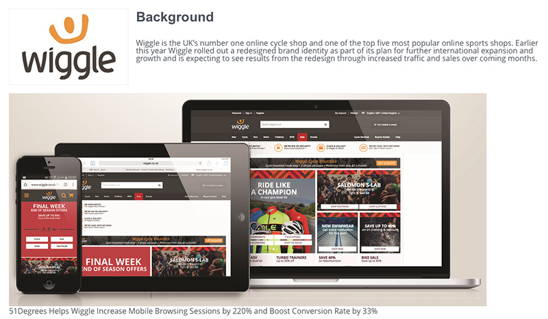
 This is the approach that was recently adopted by Wiggle.com, the UK’s number one online cycle shop. Following analysis, it concluded that people were more likely to buy smaller ticket priced items on a mobile phone, while considered purchases, such as expensive bicycles, would still be made on the desktop. With the help of device detection, Wiggle.com, the UK’s number one online cycle shop for each different device type visiting the website. As a result, it is delivering tailored content to its web visitors whatever device they use to visit the site.
Device detection can also aid web analytics. By adding detailed device specifics to high volume websites, certain correlations can be spotted between devices and user abandonment. This may highlight issues with excessive video buffering; leading to website drop-offs associated with particular devices. Device detection can flag issues with development and design that may not have otherwise been visible.
Context critical
For websites to be more profitable, context is critical. Some basic analytics will demonstrate different user behaviours on different devices. Device detection can then optimise websites to take advantage of this. As smartphones and tablets become the primary platforms for browsing, it is crucial that marketing professionals work alongside web developers to ensure that device detection solutions are considered to keep up with technological advancements, communicate company messages and increase revenue.
The ability to differentiate between different device types, brands and specific characteristics enables a website to deliver a unique and relevant experience to every visitor – and one that will drive improved user experience and profitability.


 This is the approach that was recently adopted by Wiggle.com, the UK’s number one online cycle shop.


Leave your thoughts